See how I'd find what's stopping new sign-ups from becoming active users
I reviewed Productboard, a product management platform, from the marketing page to the moment it first proves itself.
I had no access to their team or their data, only what any new user can see.
The Onboarding Sprint does this for your product, with your data and your team’s knowledge behind it.
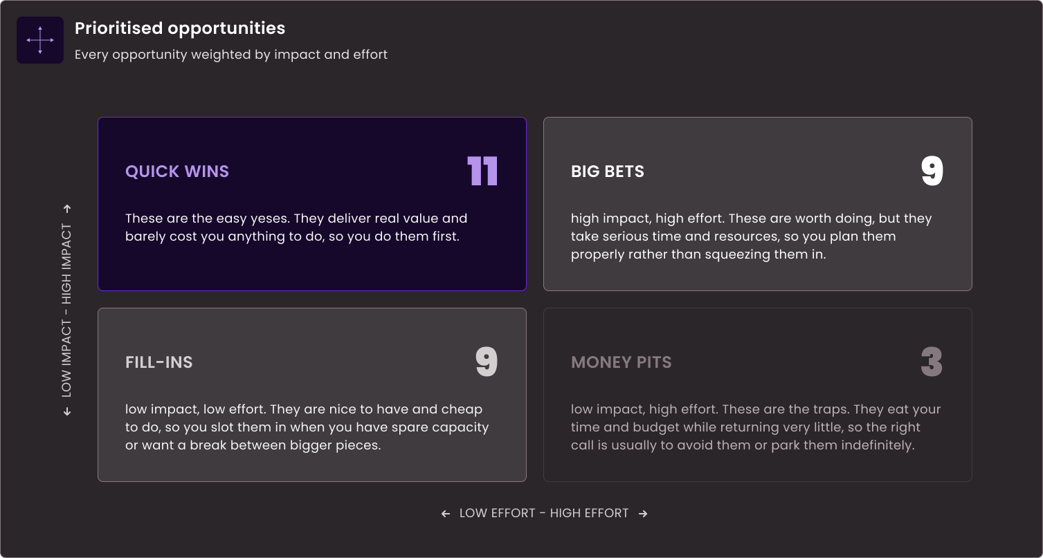
15
Works well
13
Minor problem
13
Major problem
7
Likely blocker
The review
How Productboard onboards new users
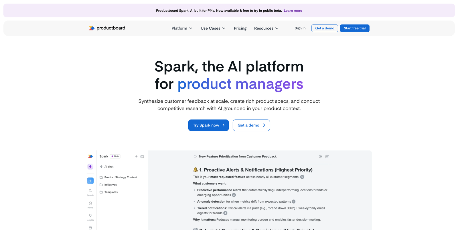
Landing page - above the fold
Major problem
The hero sells Spark, the logo says Productboard, and nothing connects them
The first thing visitors see asks them to work out what this product even is before they can decide whether it’s for them. The headline names a product called Spark. The logo says Productboard. Nothing in the hero explains how the two relate, whether Spark is part of Productboard, a separate product, or a new name for the same thing.
This is the top of the funnel, where visitors commit least because they’ve invested nothing yet. A naming question they can’t answer in a second is enough to send them off before they scroll.
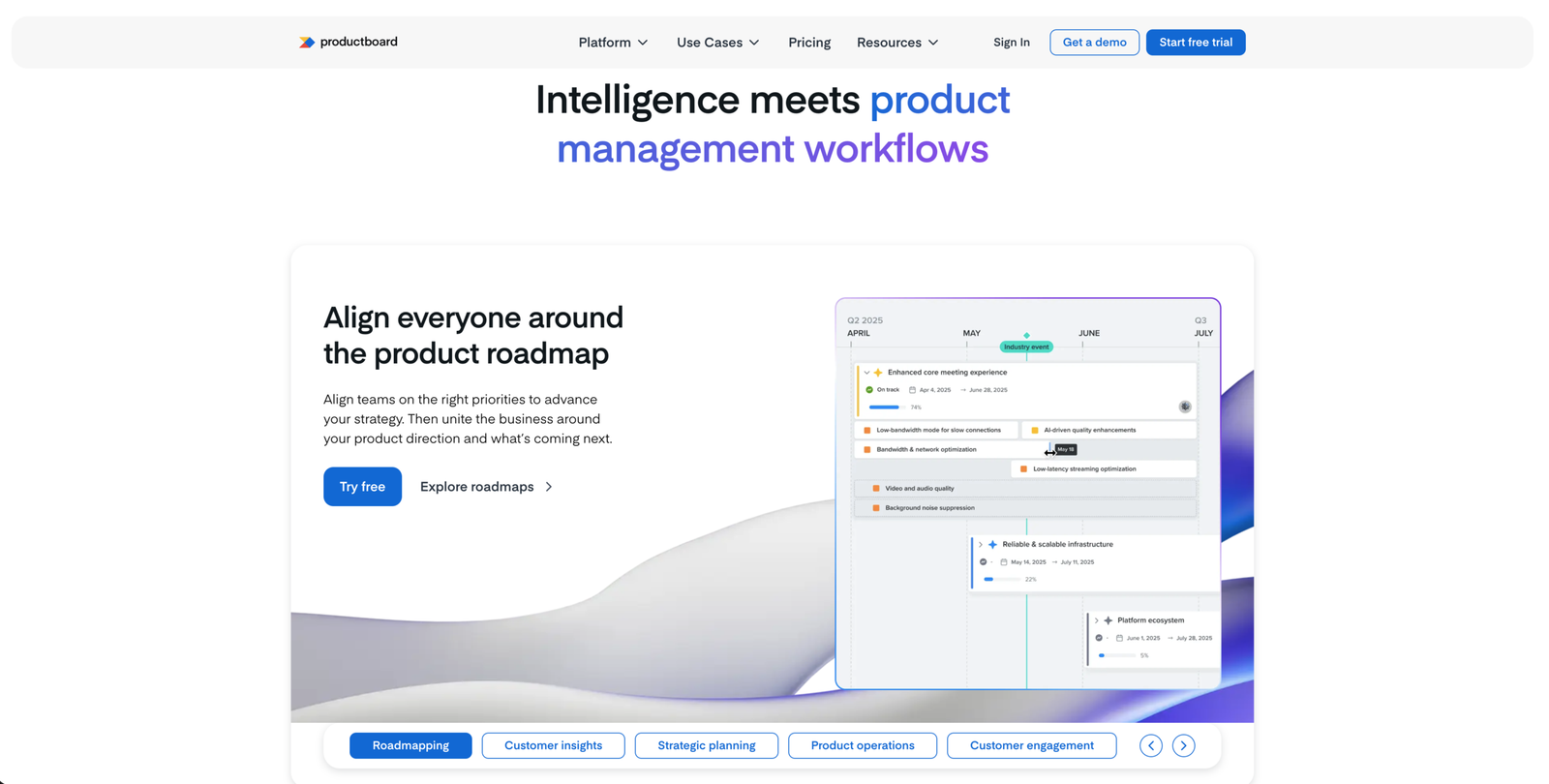
Landing page
Likely blocker
The mixed references to Spark and Productboard never get reconciled.
The visitor already met both names in the hero. Further down the page, different elements keep pointing to one or the other with no rule for which is which. Nothing ever connects them.
The hero raised the question. The rest of the page was the chance to answer it. By the time the visitor reaches the point of starting a trial, they still can’t say what the product is called or what they’d be signing up for. A question that started as friction at the top becomes the reason they don’t commit at the bottom.
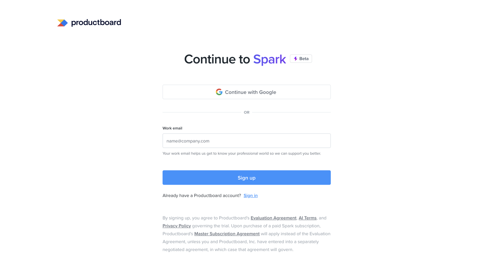
Sign up - Spark
Major problem
The "Try Spark now" CTA leads here, to a page headed "Continue to Spark," yet it carries the Productboard logo and Productboard legal copy
Productboard runs two sign-up paths from the landing page: one into Productboard, one into Spark, their AI platform. This is the Spark path. The visitor chose it, landed on a page headed “Continue to Spark,” and the logo and legal terms then point back to Productboard.
So even on the path built for one product, the two names stay tangled. The legal copy is where it shows most clearly, naming both products in a way the visitor can’t untangle. They still can’t tell whether they’re signing up for a standalone Spark or for Productboard with Spark inside it, right at the moment they hand over an email and agree to terms.
Sign up - Productboard
Major problem
The "Start free trial" CTA leads to a different signup, headed "Create your free trial" with no mention of Spark.
The landing page runs two sign-up CTAs: “Try Spark now” and “Start free trial.” This is where “Start free trial” lands. The page, the customer quote, and the logos all present a Productboard trial. Spark appears nowhere.
But “Start free trial” is the more natural phrase to click for anyone ready to sign up, including someone who came for Spark. They click it, land here, and nothing tells them this is the Productboard product rather than the one they wanted. The page can’t catch the mismatch, so a visitor who wanted Spark gets quietly routed into Productboard with no sign they took the wrong door.
Sign up - Productboard
Works well
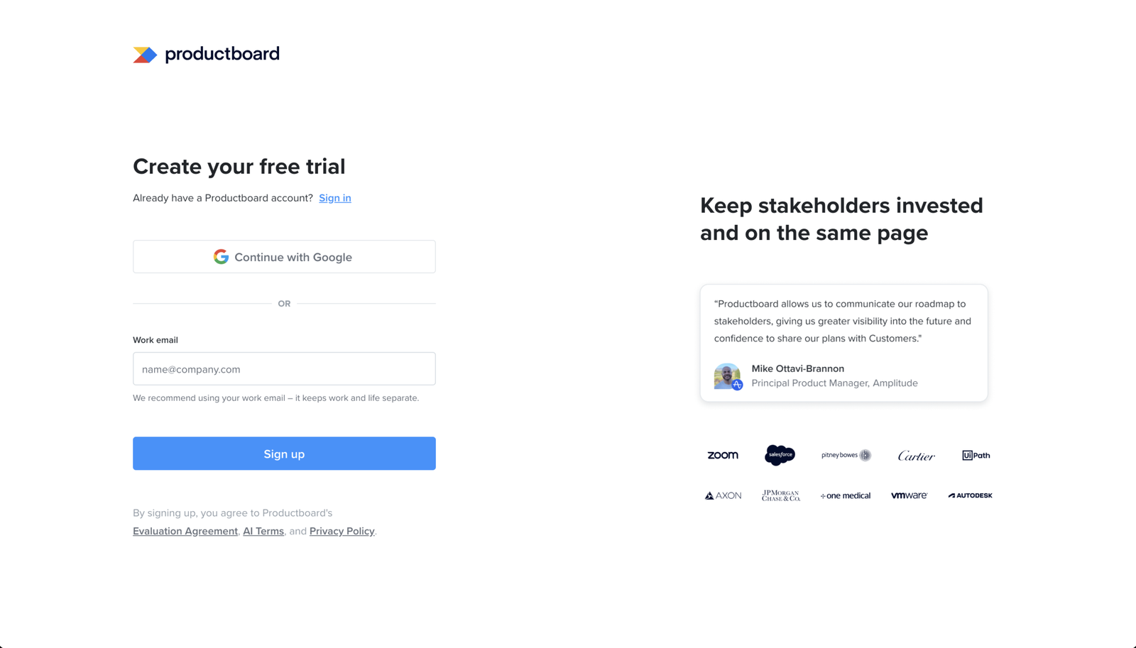
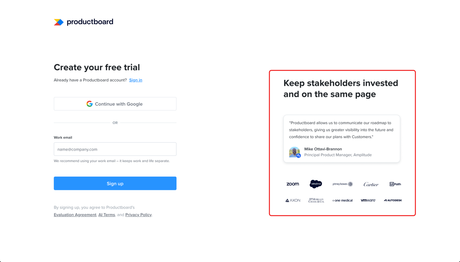
The signup form puts proof that the product delivers right where the user decides whether to commit.
A customer quote and logos like Zoom, Salesforce and JPMorgan Chase sit right beside the form. At signup the user is weighing whether this is worth their time and whether people like them trust it. Putting the proof next to the field that asks them to commit answers that doubt at the moment it’s loudest.
Sign up - productboard
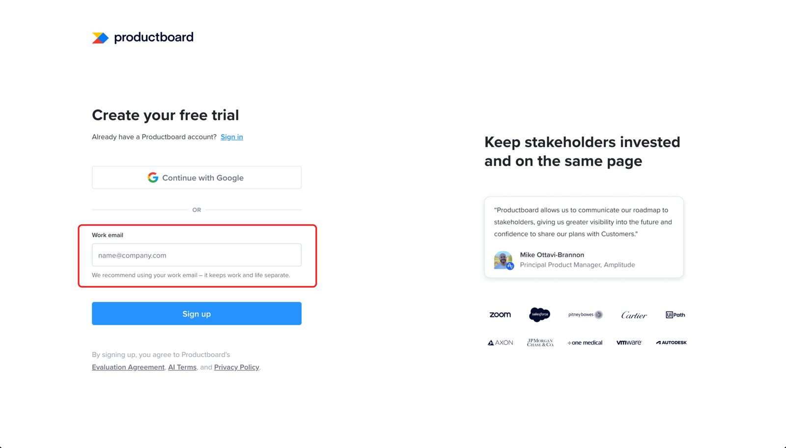
Minor problem
The work email helper text explains the request in a way that does little for the user
The field asks for a work email and explains it as a way to “keep work and life separate.” On a tool the user is setting up for work, that doesn’t tell them much.
A more useful line would say what the work email actually does: connect the account to their company and the team they’ll work with. That one line is the only place the form explains the request, and saying what it unlocks would have made better use of it.
Sign up - Email verification
Minor problem
The verify email page does not show which email address the login link was sent to.
After sign-up, the page asks the user to verify their email but doesn’t show the address they entered. For anyone who typed it correctly, that costs nothing.
If the address was mistyped, though, there’s no way out from this screen. The user sees nothing to reveal the mistake, no address to check against, and no way to re-enter it. They’re left waiting on an inbox that will never get the link, with no prompt to try again.
Sign up - Email verification
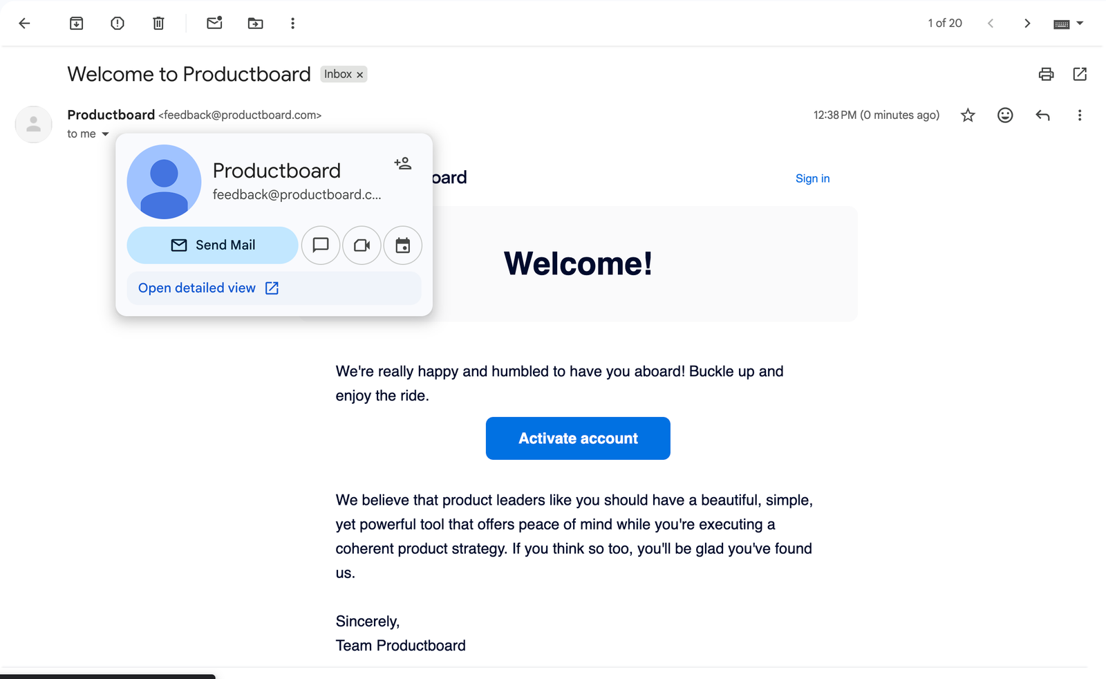
Minor problem
The verification email reads more like a welcome message than a step needed to finish signup.
The email has a clear “Activate account” button, but the subject and headline lead with welcoming the user rather than signalling that this is the email that unblocks them. The sender adds to it, arriving from feedback@productboard.com, which reads like a feedback inbox rather than the account email they expect.
This step sits on the critical path. The user can’t get into the product until they find this email and act on it. Anything that slows recognition adds drop-off risk to a step that has to happen, which is what makes a friendly, well-built email still worth fixing.
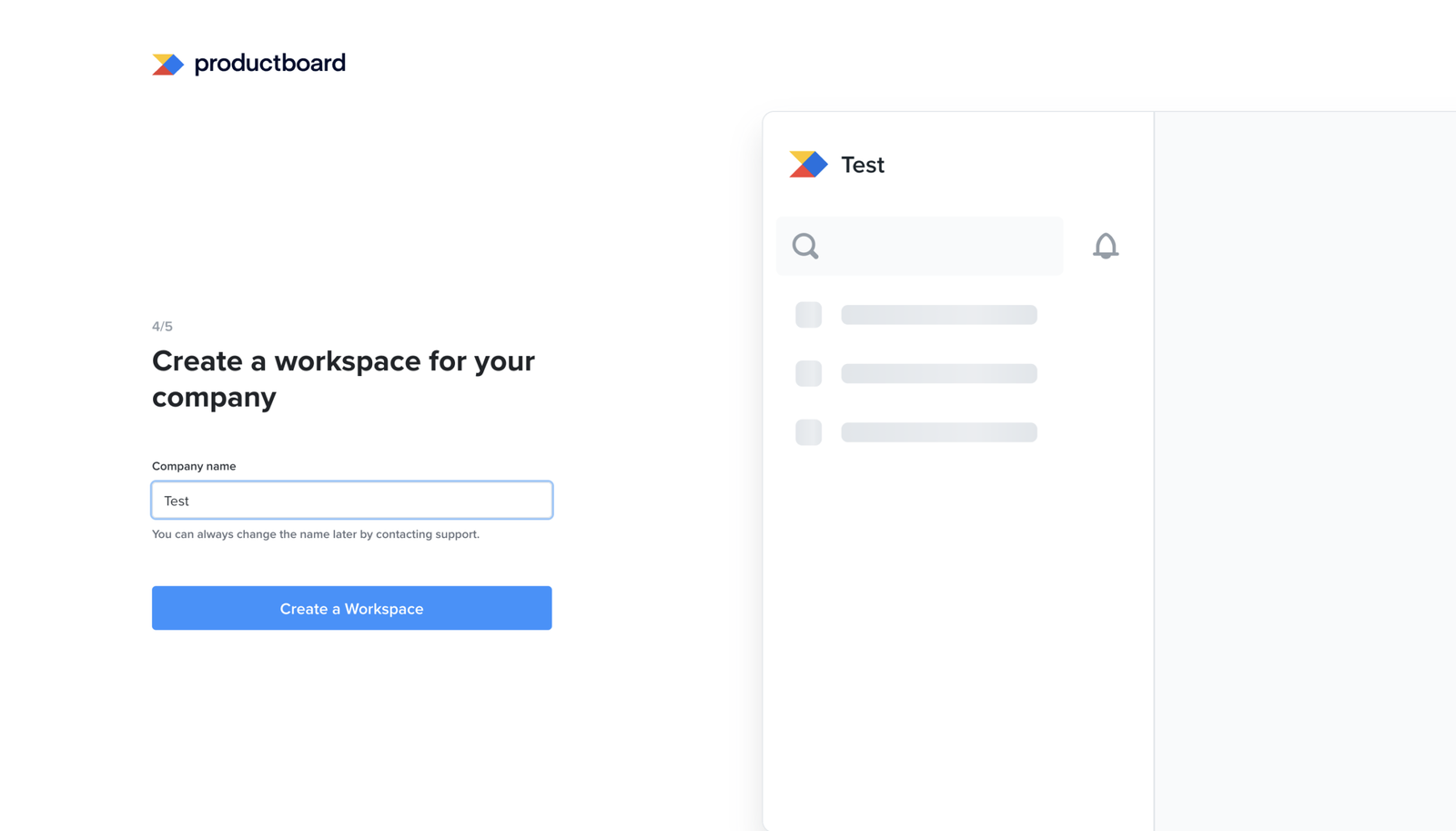
Account setup
Works well
The password field shows the rules before the user starts guessing.
The password field explains the requirements upfront: at least 12 characters, one lower case letter, and one number. This helps the user create a valid password before they submit the form, instead of finding out only after something fails.
Account setup
Minor problem
The setup flow says it will tailor the experience, but the journey that follows stays the same
The page asks for company size, team, and role, and frames it as a trade: share this, and the experience gets tailored. After the user answers, the journey doesn’t visibly change.
Users have a learned mental model for these “tell us about yourself” screens, so they answer without friction and rarely leave over it. The cost is quieter. The product made an explicit promise and didn’t visibly keep it.
Onboarding runs on the user trusting what the product tells them. A prompt that asks for something, gives a reason, then doesn’t deliver on that reason spends a little of that trust. One instance won’t break the journey. But each unkept promise makes the next prompt easier to ignore, and the product needs those later prompts to land.
Account setup
Major problem
The setup flow forces users to pick one need from a list where the honest answer is all of them
The page asks the user to choose a single top need. The options describe coordinating execution, building roadmaps, prioritising what to build, engaging customers, centralising feedback, and aligning strategy to business goals. For the senior product person this screen is built for, those are not competing choices. They are the job, and most of them depend on each other.
So the user is asked to rank one above the rest when their real answer is that they need all of them. That’s a hard question with no honest answer, placed at step 3 of 5 before they’ve reached anything useful.
The page says the choice will focus onboarding, which is the reason given for making them pick. After they answer, the journey doesn’t visibly change. So the difficulty buys the user nothing. They’re made to make a forced call, for a benefit that doesn’t arrive.
Account setup
Works well
The workspace name updates in the product preview as the user types.
When the user enters a company name, the preview on the right updates to show that name inside the workspace. It is a small but useful piece of feedback: the user can see how the name will appear before creating the workspace.
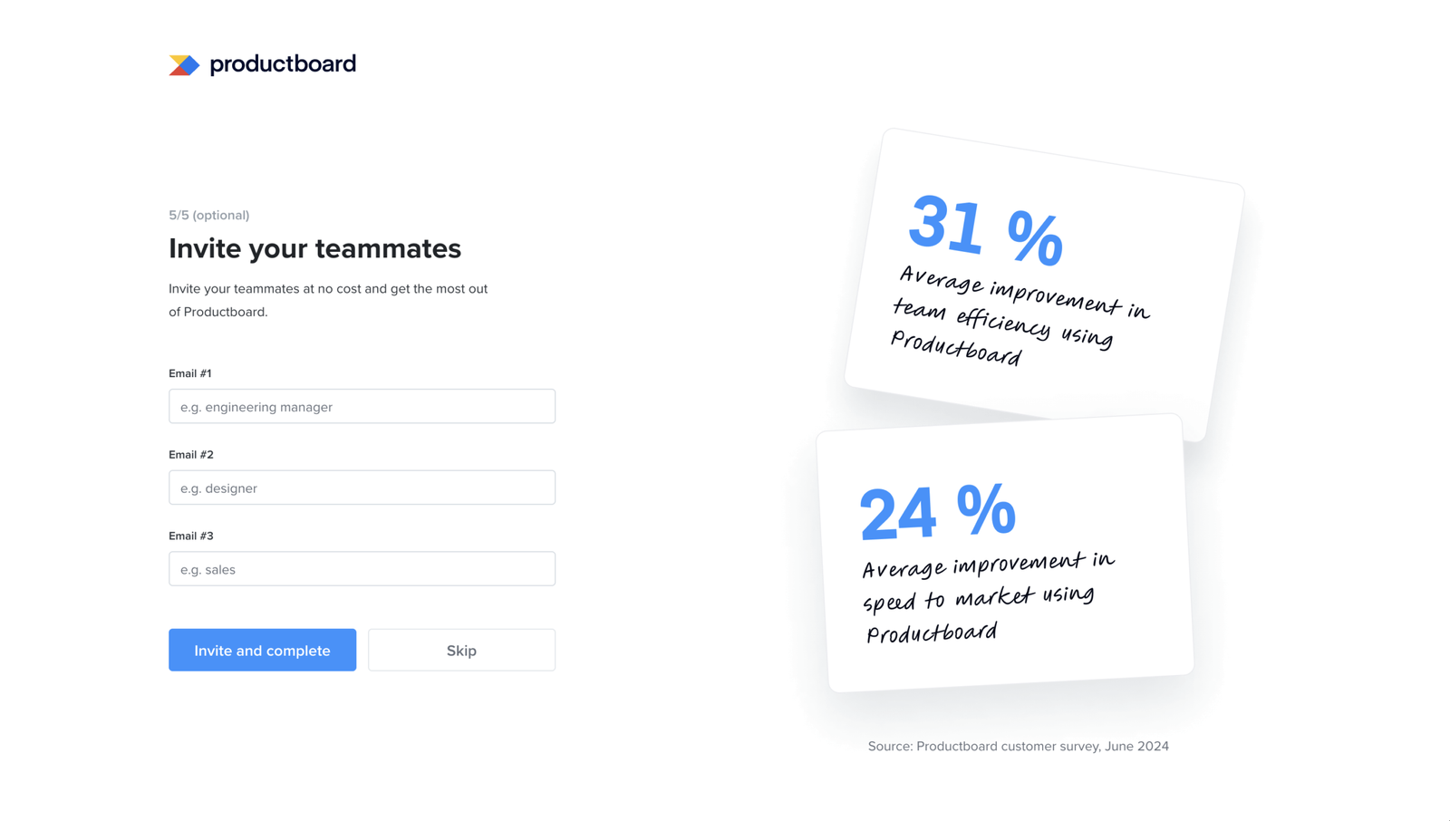
Account setup
Works well
The invite step gives a reason to invite teammates and makes it easy to skip
The final step asks the user to invite teammates. It does two things well.
It doesn’t block. The step is marked optional and has a clear Skip button, so the user can finish setup without it. It gives a reason before asking. The screen shows that invites are free and includes two sourced figures on what teams get from using the product together. The user sees why the step is worth doing before they decide.
This is what a good optional step looks like. It gives a clear reason to act and makes skipping just as easy.
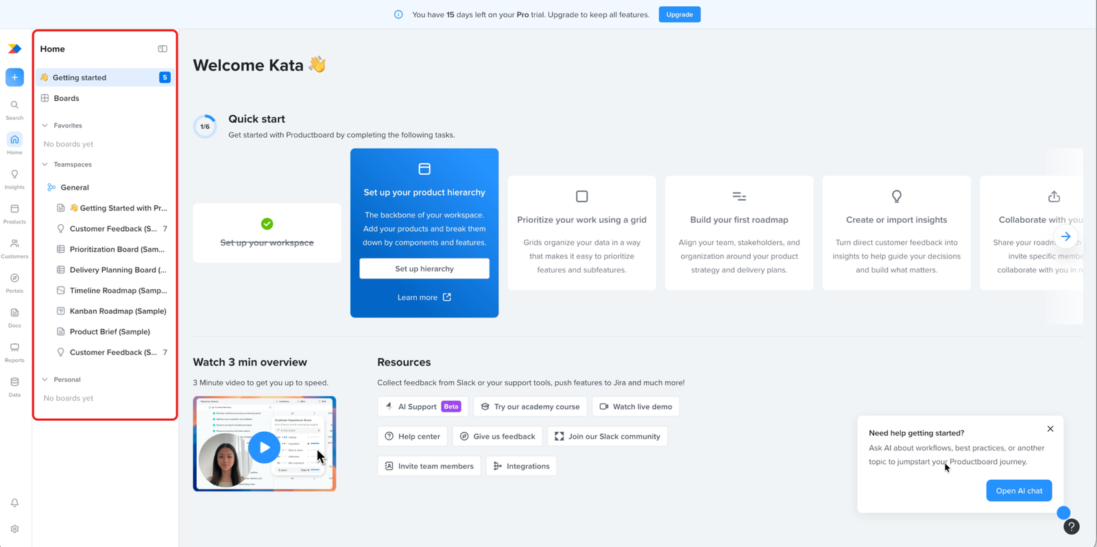
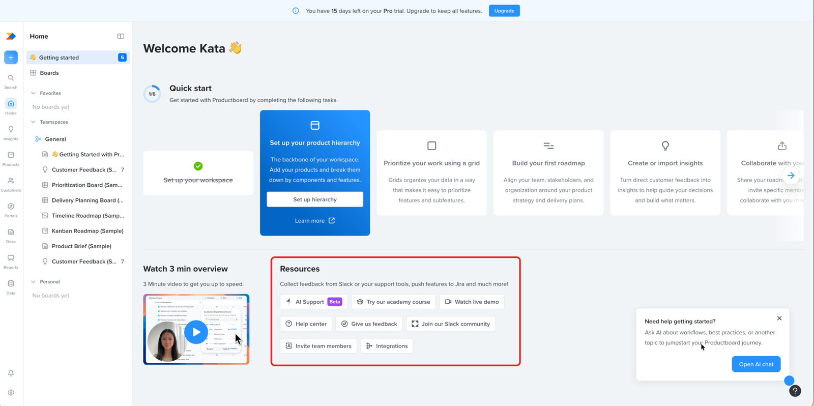
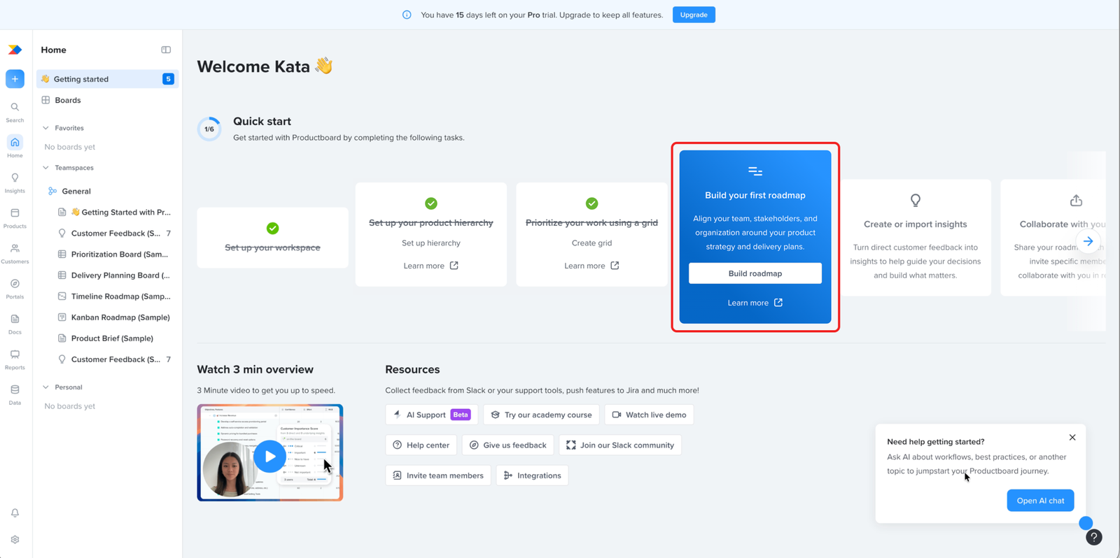
Dashboard
Minor problem
The open navigation panel competes with the user's first task: working out how to start
The navigation panel sits open on first load, filled with teamspaces, sample boards, and empty sections placed there to show the user what the product can hold.
That doesn’t help on the first screen. Sample boards don’t build confidence. The user gets confidence from reaching their own first result, and the only thing that matters here is working out how to start.
Every element on the screen competes for that. The open panel is one more of them, pulling attention sideways at the moment the user is trying to find their way into the first task.
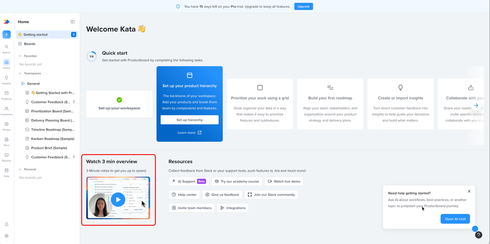
Dashboard
Works well
The overview video helps users understand how the product pieces fit together.
The dashboard includes a short overview video before the user works through the checklist. This works well because onboarding is asking the user to move through several connected areas: hierarchy, prioritisation, roadmaps, insights, and collaboration. The video gives useful context for how those parts relate before the user starts completing individual setup tasks.
Dashboard
Minor problem
Setup actions sit inside the Resources section, where users scanning to read won't look to act
“Invite team members” and “Integrations” sit in the Resources section, grouped with the help centre, academy course, live demo, and Slack community.
A “Resources” label reads as things to go and read. Invite and Integrations are setup actions. A user looking to bring their team in or connect their tools won’t scan a help section to do it, so a real setup action gets passed over.
The actions belong on the dashboard. The grouping is what buries them.
Dashboard
Minor problem
The checklist frames onboarding as tasks to complete, not outcomes the user will get.
The checklist subtitle says, “Get started with Productboard by completing the following tasks.” That tells the user what they have to do, but not what they will get out of doing it. For someone who has not yet seen the product’s value, this can make onboarding feel like admin work rather than a path to something useful.
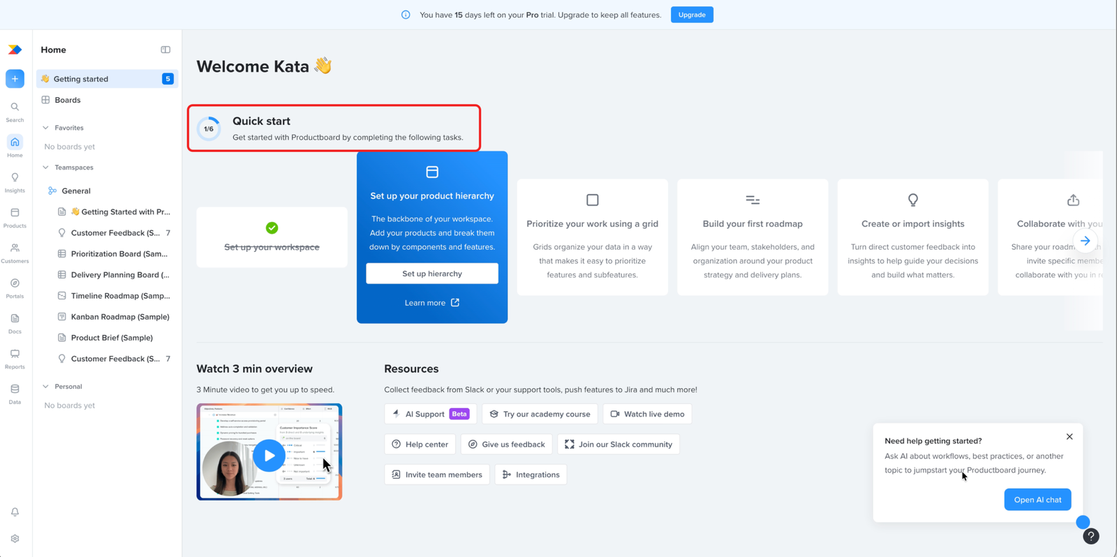
Dashboard
Likely blocker
The checklist puts insights after the steps that depend on it
The Quick Start checklist sets the recommended order, and it places insights after prioritising and roadmapping. Both of those steps need insights to mean anything. A team prioritises and builds a roadmap from what customers are telling them. With insights still to come, the user reaches those steps with nothing to work from and can’t finish them. The product’s own overview video puts insights first, so the checklist contradicts the order the product itself recommends elsewhere.
That’s the activation cost. A user following the recommended path spends their first session on steps that can’t be done yet, and reaches the end having set up nothing real.
Dashboard
Minor problem
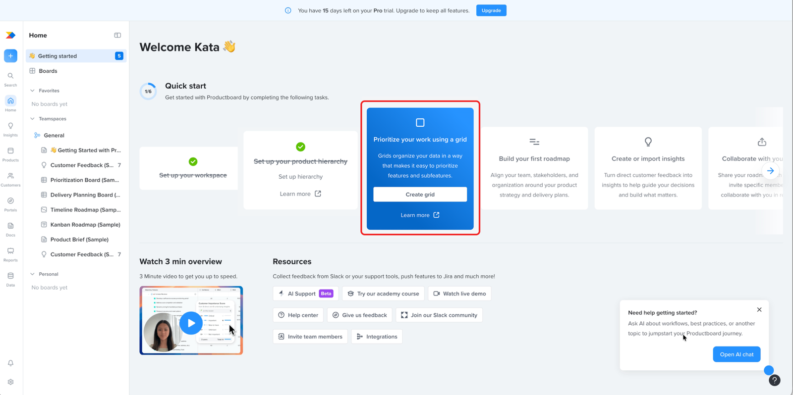
The first screen marks the next task clearly, then surrounds it with everything else at once
The active task is easy to find. The highlighted “Set up your product hierarchy” card and the 1/6 counter mark it as the next step, so the user can see where to start.
It just lands inside a screen carrying a lot at the same time: a three-minute video, a wall of resource and learning links, an AI chat popup, a trial-upgrade banner, and a full navigation panel. Each one is reasonable on its own. Together they make the first screen something the user has to work through before they get to the step that matters.
On a first visit, before the product has shown any value, that’s a lot to take in for a screen whose job is to get the user into a single first step.
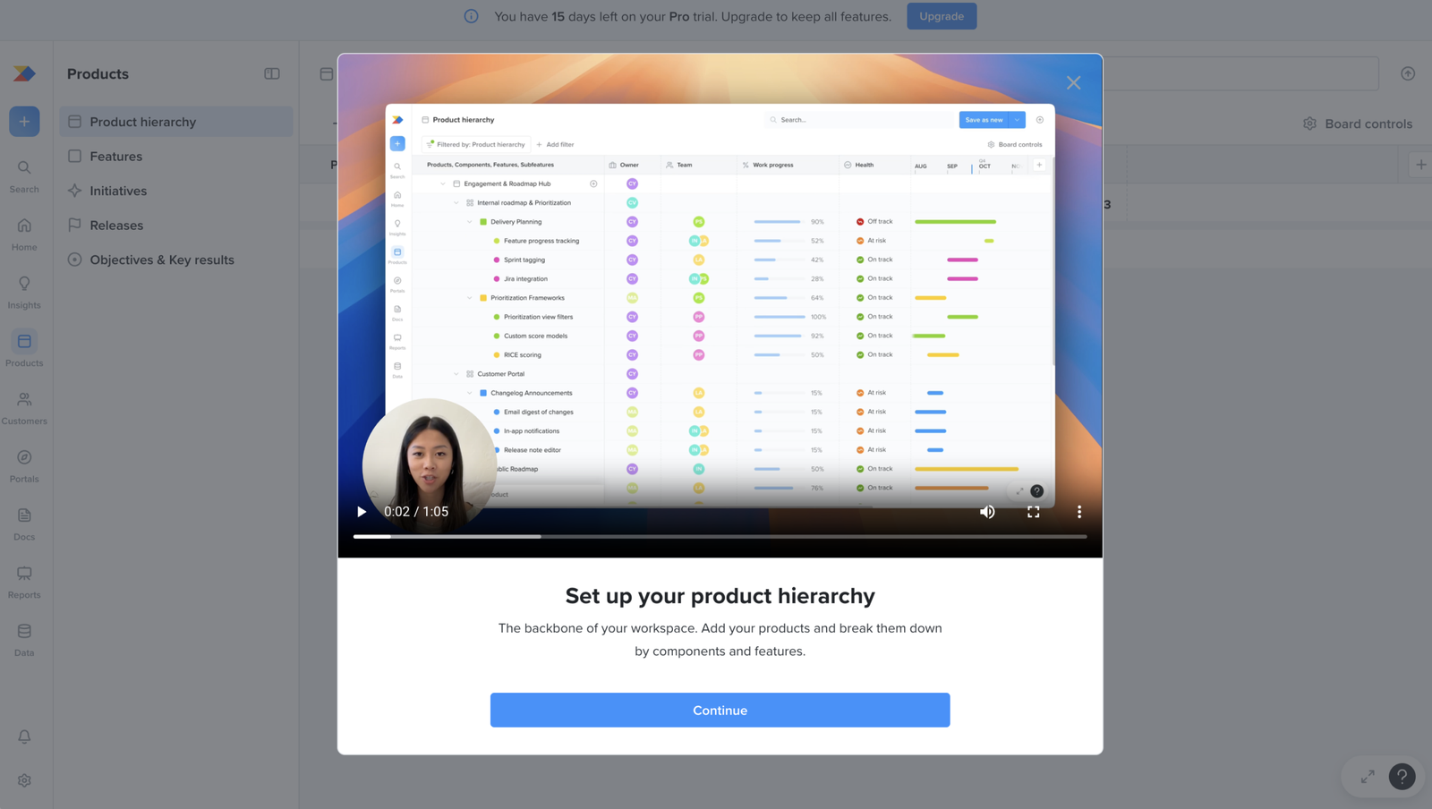
Product hierarchy setup
Works well
The product hierarchy task starts with a video that shows both the goal and the steps.
After the user clicks “Set up your product hierarchy”, the task opens with a short video before asking them to continue. The video is useful because it explains what product hierarchy is for and shows how to set it up inside the product. That gives the user context before they start the task.
Product hierarchy setup
Major problem
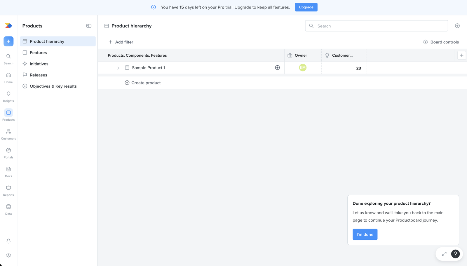
The first task promises setup, but the screen drops the user into a sample with no guidance on building their own
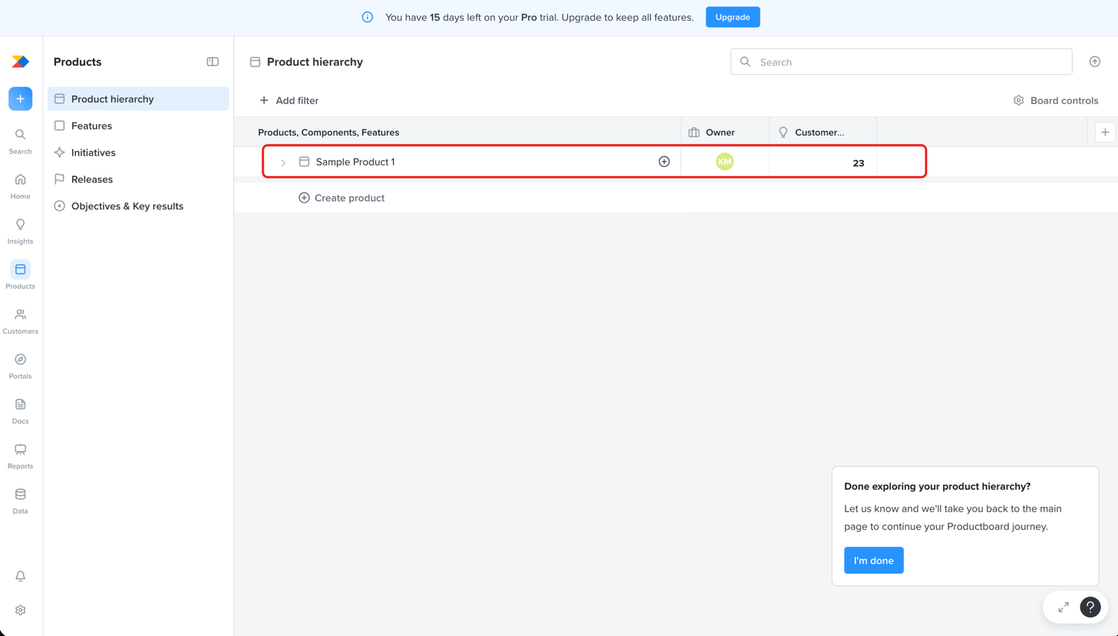
The user picks the recommended first task, “Set up your product hierarchy,” and lands in the Products area with a sample product and a “Create product” button.
Nothing on the screen moves the user toward building their own hierarchy: products broken into components and features, the structure the task called the backbone of the workspace. All the user gets is a sample showing a finished result.
So at the first real step of setup, the user has to work out the whole task alone, with no guidance on how to build the hierarchy it asked for.
Product hierarchy setup
Major problem
The sample product is the only guide to a good hierarchy, so the user can't tell whether it's safe to clear
The page gives no instructions for building a hierarchy. The only reference is the sample product already in the workspace, which shows what a finished structure looks like. To build their own, the user works alongside it.
That creates a bind once they start. The sample sits among their real products and clutters the workspace, so they’ll want to remove it. But it’s also the only example they have, and they know five more steps depend on the hierarchy. They can’t tell whether a later step will still expect that example to be there.
So the user is left guessing. Clear the sample and they may lose the only guidance the product gave them, right before a step that builds on it. Keep it and their real work sits mixed with fake data. With nothing else on the page to guide them, they have no way to know which choice is right.
Product hierarchy setup
Major problem
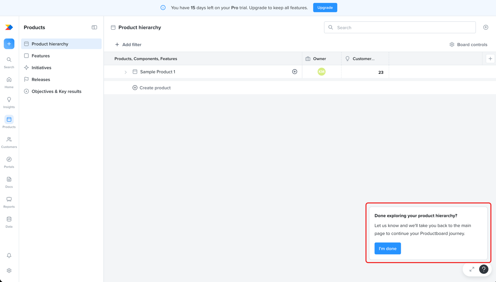
The popup reframes the setup task as exploration, and lets the user finish it with nothing built
The task asks the user to set up their product hierarchy. The popup asks whether they’re “done exploring” it, with an “I’m done” button that takes them back to the main page.
That turns a build task into a browse. The user reads the sample, decides they’ve seen enough, and clicks “I’m done”, having created no products, components, or features of their own.
So the checklist marks the task complete when nothing has been built.
Product hierarchy setup
Major problem
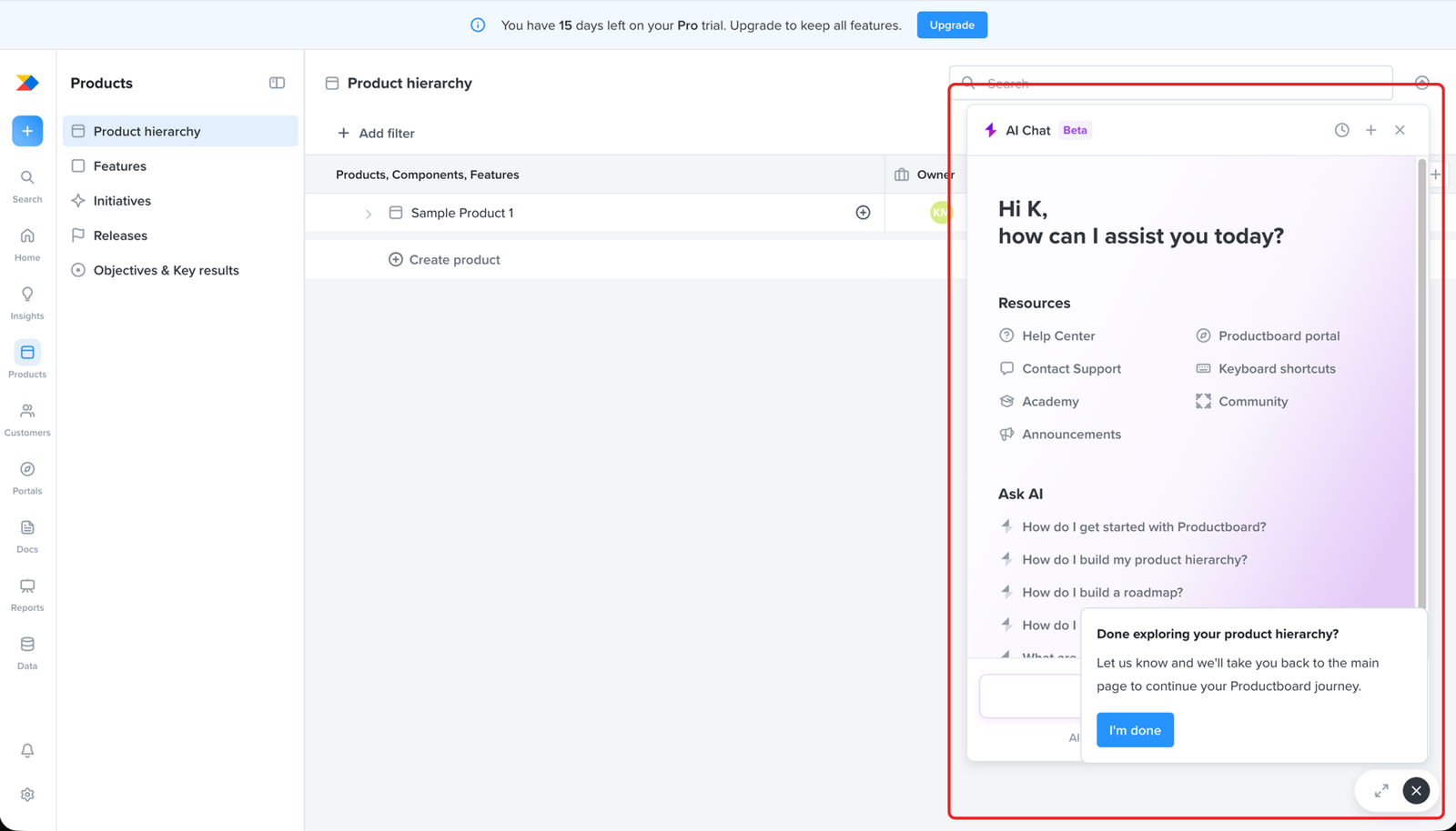
The AI assistant is available as fallback guidance, but another popup covers it.
The AI chat is where the user can get help with this step. It even shows the exact question they need: “How do I build my product hierarchy?”
The “Done exploring your product hierarchy?” popup opens over the chat and covers part of it. Whatever the user asks, they can only read some of what comes back, so the help they came for is hard to use.
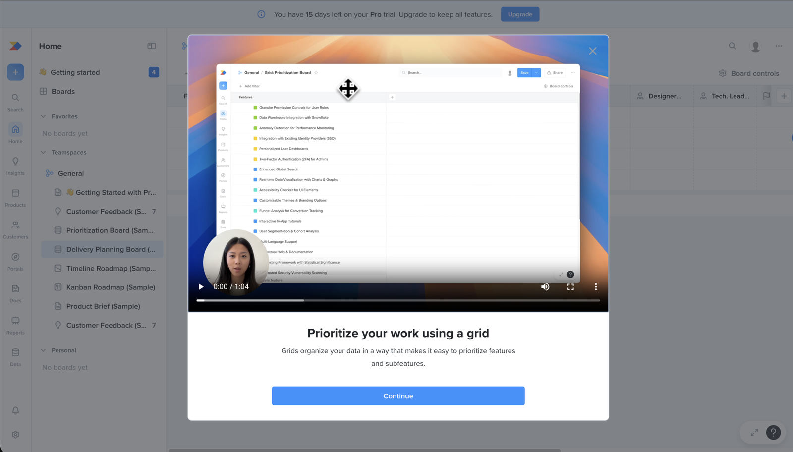
prioritisation
Likely blocker
The prioritise step comes before the user has any customer insights to prioritise
This step asks the user to prioritise their features using a grid. Prioritising means weighing features against what customers need.
The user has no customer insights in the product yet, so there’s nothing to weigh the features against. They can open the grid and move things around, but the ranking rests on nothing.
A step that only works once insights exist, placed before the insights step, points at what this onboarding is really doing. It’s walking the user through the product’s features in turn, not helping them set up a board they can use.
prioritisation
Minor problem
The prioritisation walkthrough tours a sample board instead of guiding the user through the task
The prioritisation step opens with a video. The walkthrough moves through the board, browsing and filtering features.
A user watching to learn what to do here sees someone move around a finished board, not how to set up one of their own.
So the video plays the same role as the steps before it. It shows the user around the product rather than helping them set up a board they can use.
prioritisation
Likely blocker
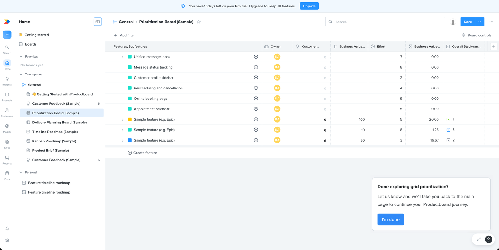
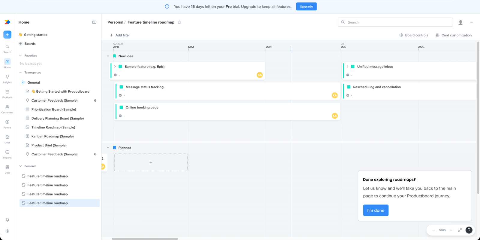
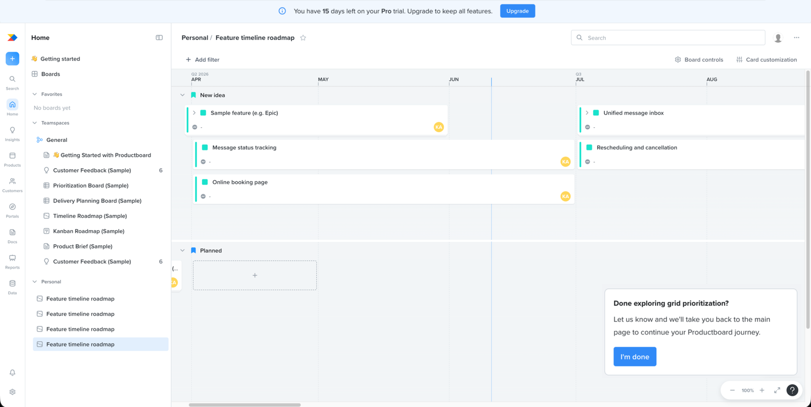
The prioritisation step is another look around a sample board, not work on the user's own product
The user reaches prioritisation and moves no closer to setting up their own product. The board is filled with sample features and scoring columns, business value, effort, stack-rank, and none of it is theirs. With nothing of their own product here, the step turns into reading someone else’s sample.
The “Done exploring grid prioritisation?” popup confirms it. The way out is “I’m done”, the same exit as the earlier steps, so the step ends as a look around rather than anything that moved the user’s setup forward.
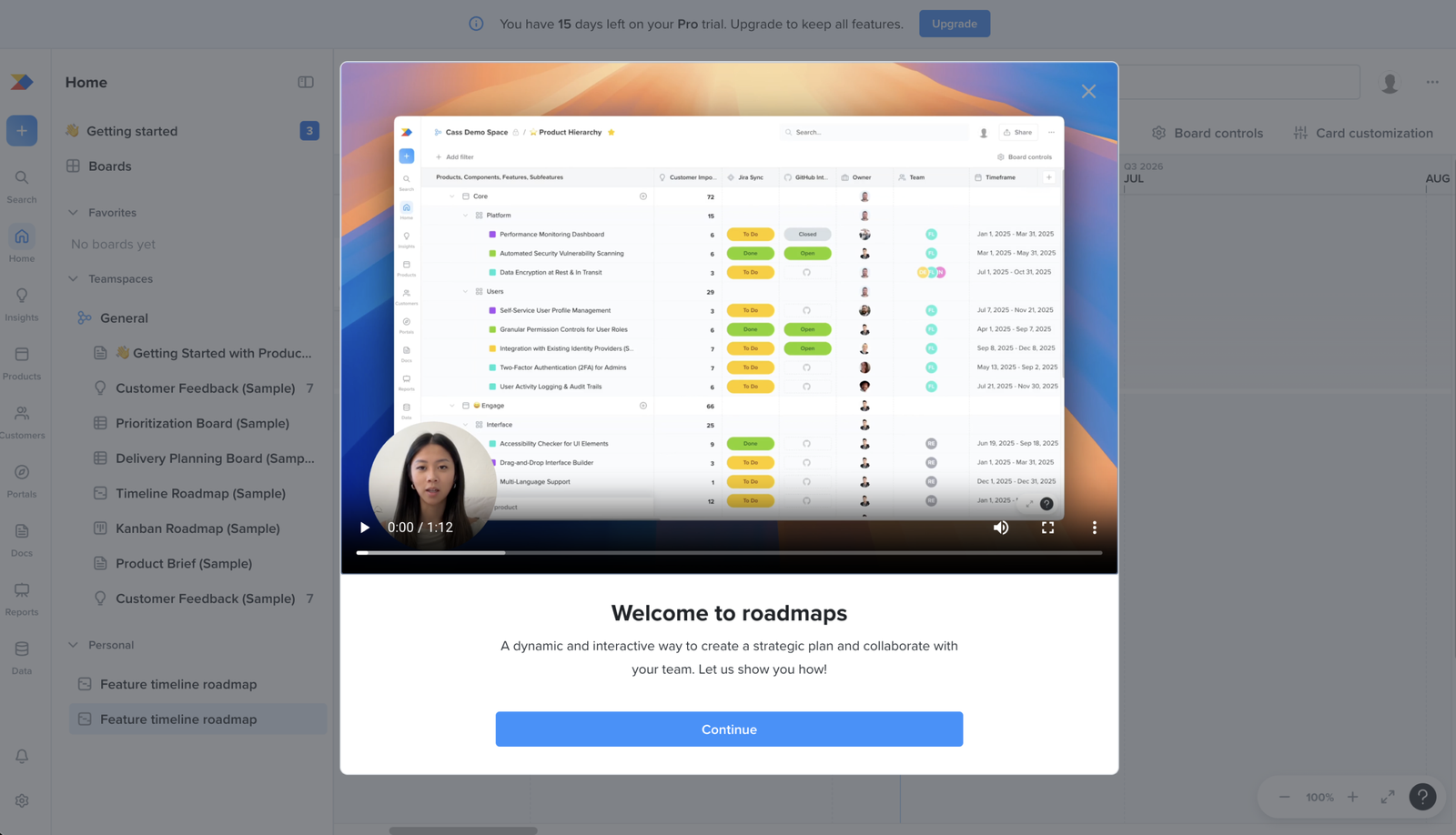
Roadmaps
Likely blocker
The roadmap step asks the user to build from prioritised work and insights they haven't set up
The user reaches the roadmap step with nothing to build from. A roadmap rests on prioritised features and the customer insights behind them. The user hasn’t set up either in the product yet, so there’s nothing of their own to shape a roadmap around.
roadmaps
Works well
The roadmap video shows the board and how to create a roadmap.
The roadmap task starts with a video that shows the relevant board and walks through how to create a roadmap. That makes the task guidance clearer than a general feature tour. The caveat is that, because the checklist asks users to build a roadmap before setting up insights, the video can explain the action but cannot solve the fact that the user may not yet have the inputs needed to complete it meaningfully.
roadmaps
Likely blocker
The same failure repeats here: another step that asks for setup, then offers nothing but sample data to work on
By the roadmap step, the pattern is clear. The hierarchy step, the prioritise step, and now this one all ask the user to set something up, then put them in front of sample data with no way to do it with their own product.
roadmaps
Major problem
The roadmap mixes sample items with the user’s own data.
The roadmap board shows sample data alongside the user’s own feature from earlier setup. This gives the user an example to look at, but it also blurs what belongs to Productboard’s demo and what belongs to their workspace.
insights
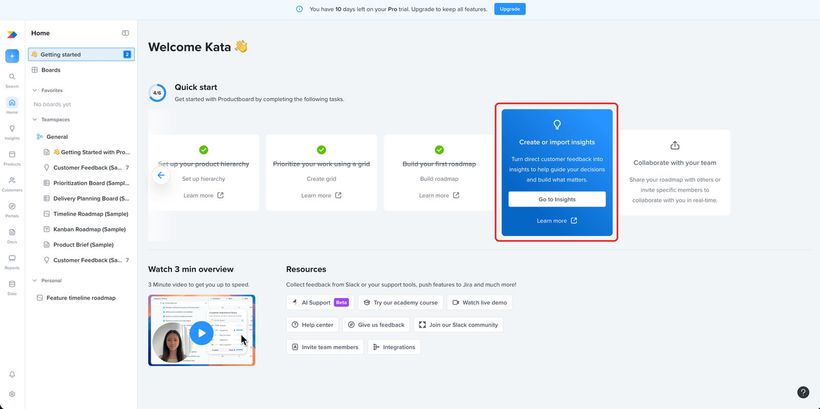
Likely blocker
The step everything else is built on sits at position four, after the steps that needed it
Prioritisation and roadmapping both run on insights, the customer feedback that tells a team which problems matter. That step comes after both of them, so the user hits it having already been sent through two steps that needed it first.
insights
Works well
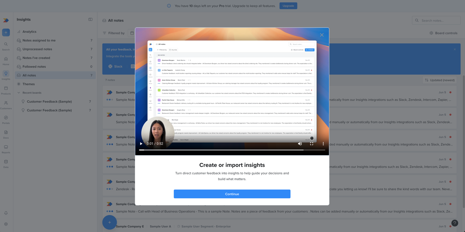
The insights video gives clear context before users enter the setup step.
The insights task starts with a video before sending the user into the product. This works well because the user is about to handle an important input for the rest of the workflow. The video gives them a clearer sense of what insights are for before they start creating or importing them.
insights
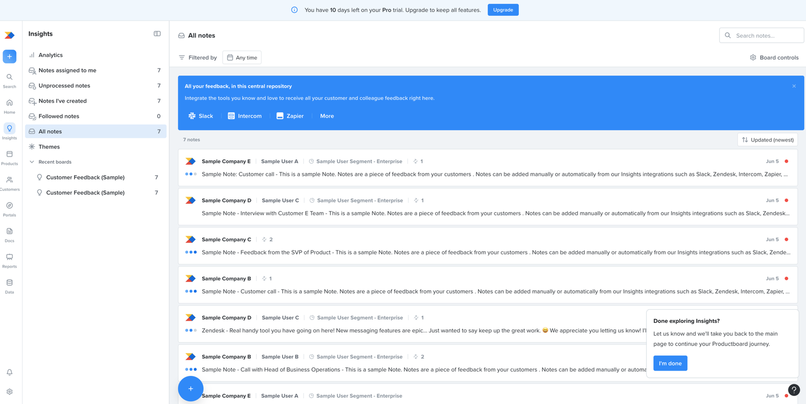
Works well
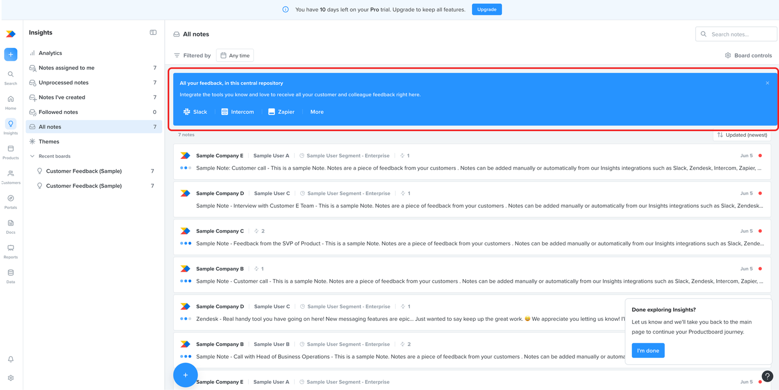
The insights area makes the purpose of customer feedback clear.
The screen explains that feedback is collected in one central place and can come from tools like Slack, Intercom, and Zapier. This makes the purpose of the insights area clear: it is where customer feedback is gathered so it can be used in product decisions.
insights
Major problem
The same sample-data bind returns here, on the board meant to hold real customer feedback
The insights step gives the user a clear way to import their own feedback through integrations. The board is already full of sample notes, fake customer quotes from made-up companies.
That forces the same choice the hierarchy step did. Leave the samples and the user’s real feedback sits mixed with invented quotes. Clear them and they lose the only example of how feedback should look.
The cost is higher here. This is the board the user comes back to for what customers are actually saying, and every prioritisation and roadmap call draws on it. Mixing their real feedback with sample notes clutters the one board they’ll rely on most.
insights
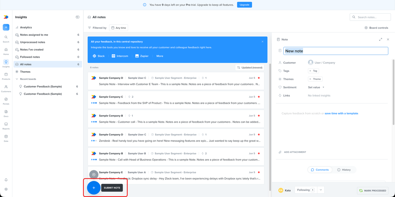
Works well
Creating a new note is straightforward once the user finds the action.
The action to create a new note is easy to find, and the note editor itself is clear. The user gets a simple area to enter feedback, so the core task of capturing a new note feels straightforward.
insights
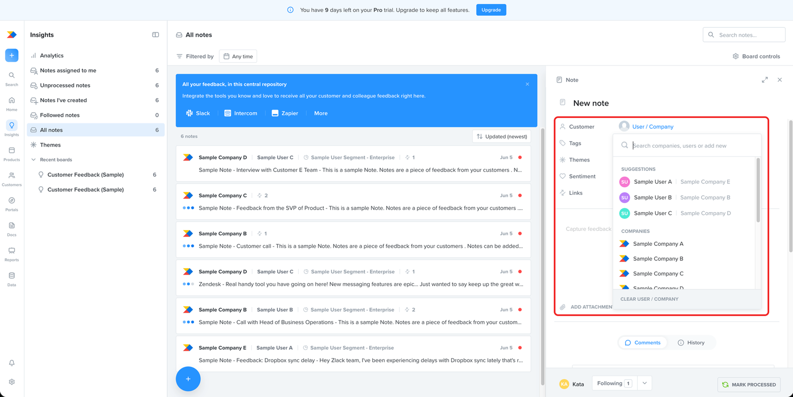
Major problem
Onboarding never shows the user how to set up their own customers, the records that make insights theirs
Creating a note opens a customer field, and what shows up is samples: sample users, sample companies. The only hint that the user can add their own is a line of placeholder text in the search box, “or add new.”
A note is only useful when it’s tied to a real customer, so the user knows whose feedback it is. The user hasn’t set up any customers yet, so there’s no one to attach it to.
Onboarding never walks the user through creating those customers and companies. The one cue sits in placeholder text, easy to pass over, so the setup that makes the whole step worthwhile is left to chance.
insights
Works well
The banner gives users a clear route for adding feedback through integrations.
The blue banner stands out at the top of the insights screen and points users towards integrations such as Slack, Intercom, and Zapier. For teams that already collect feedback in those tools, this gives a clear route for bringing existing feedback into Productboard.
insights
Works well
The integration setup is clear and easy to follow.
Once the user starts an integration, the setup flow is straightforward. The steps are clearly presented, the user can see what they are connecting, and the action they need to take next is easy to identify. This makes the process of bringing feedback into Productboard feel simple rather than technically heavy.
collaboration
Works well
The checklist includes team collaboration because the workflow depends on shared product work.
The final checklist task asks the user to collaborate with their team. This fits the product context: roadmaps, prioritisation, feedback, and product decisions usually involve more than one person. It may also reflect how Productboard thinks about activation: a workspace is likely more valuable once teammates are invited and product planning is no longer happening alone.
collaboration
Works well
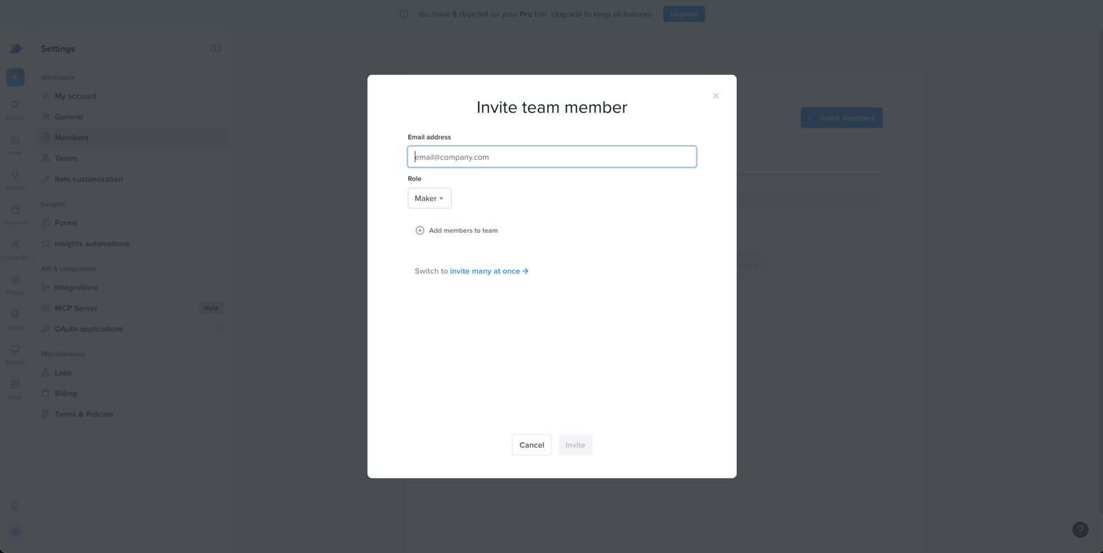
The invite flow makes it clear how to add one teammate or invite several at once.
The invite modal keeps the action simple: the user enters an email address, chooses a role, and sends the invite. It also gives a clear option to switch to inviting many people at once. This makes the collaboration step easy to act on without making the user leave the invite flow.
collaboration
Major problem
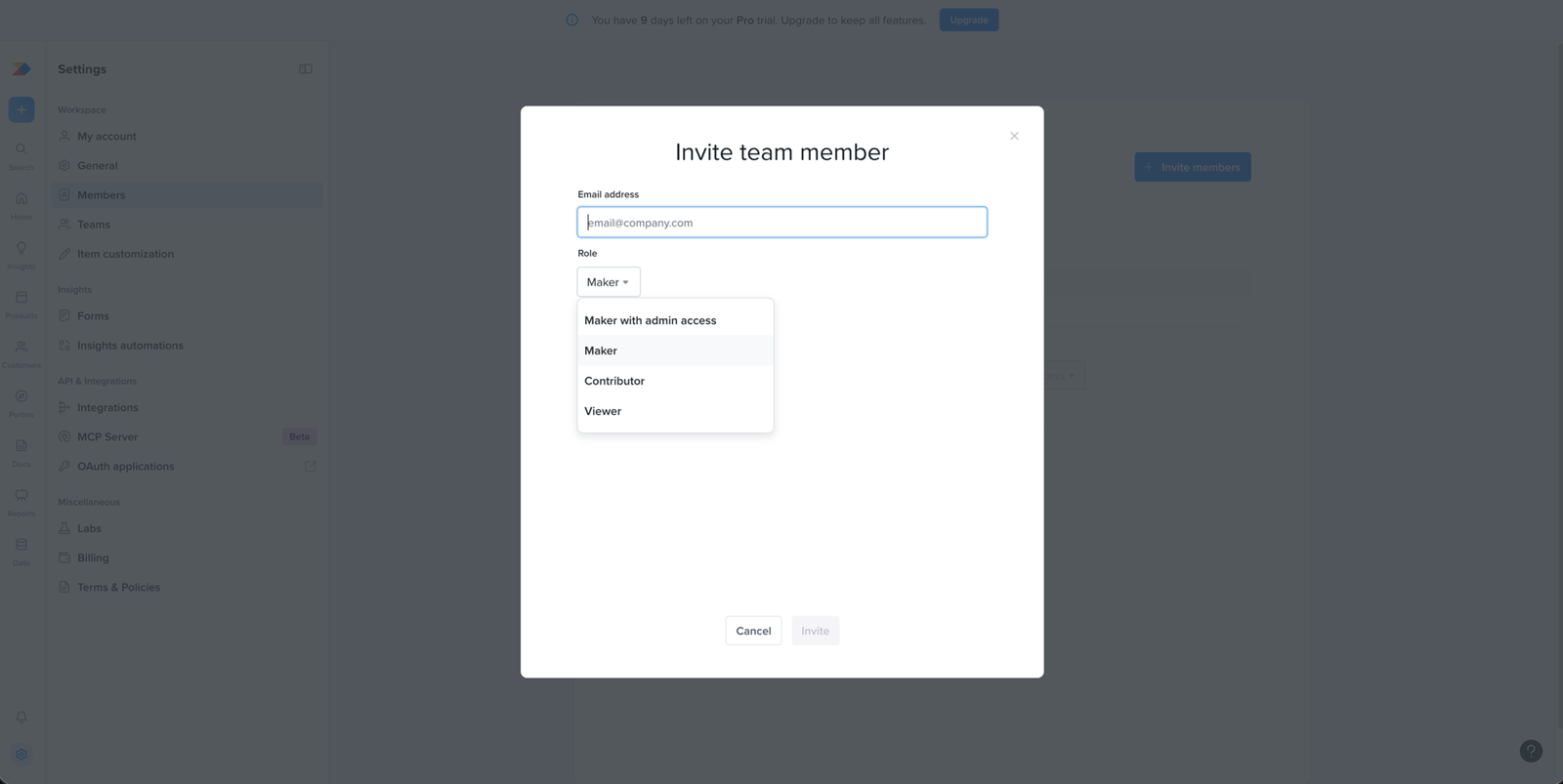
The invite defaults to a paid role without telling the user it carries a cost
The invite offers four roles, Maker with admin access, Maker, Contributor, Viewer, and defaults to Maker. Nothing on the screen says what any of them can do, or which ones are paid.
So the user assigns access to a teammate with no idea what they’re granting. Maker, the default, is a paid seat, which means the user can add cost just by accepting what’s already selected.
This works against the business too. Inviting the team is one of the things that turns a trial into a paying account. If the roles aren’t explained here and the user finds out what they picked at billing, it looks like the product kept it from them. That makes them trust it less, right when they’re deciding whether to pay.
Collaboration
Works well
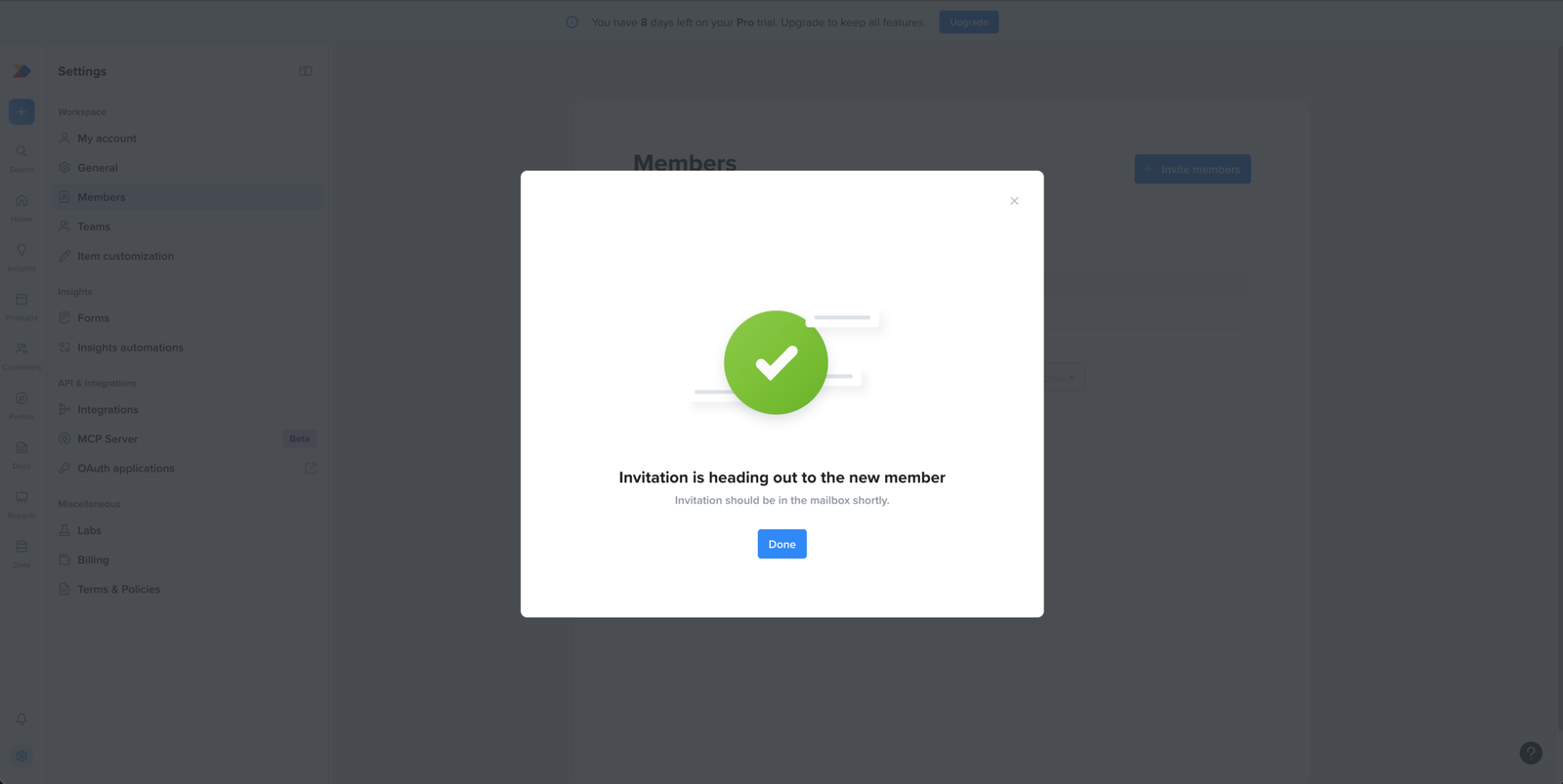
The invite confirmation gives clear feedback after the user sends an invitation.
After the user sends a teammate invite, the confirmation clearly states that the invitation has been sent and should arrive in the new member’s mailbox shortly. This gives the inviter a clear result for the action they just took, instead of leaving them unsure whether the invite was submitted.
Collaboration
Minor problem
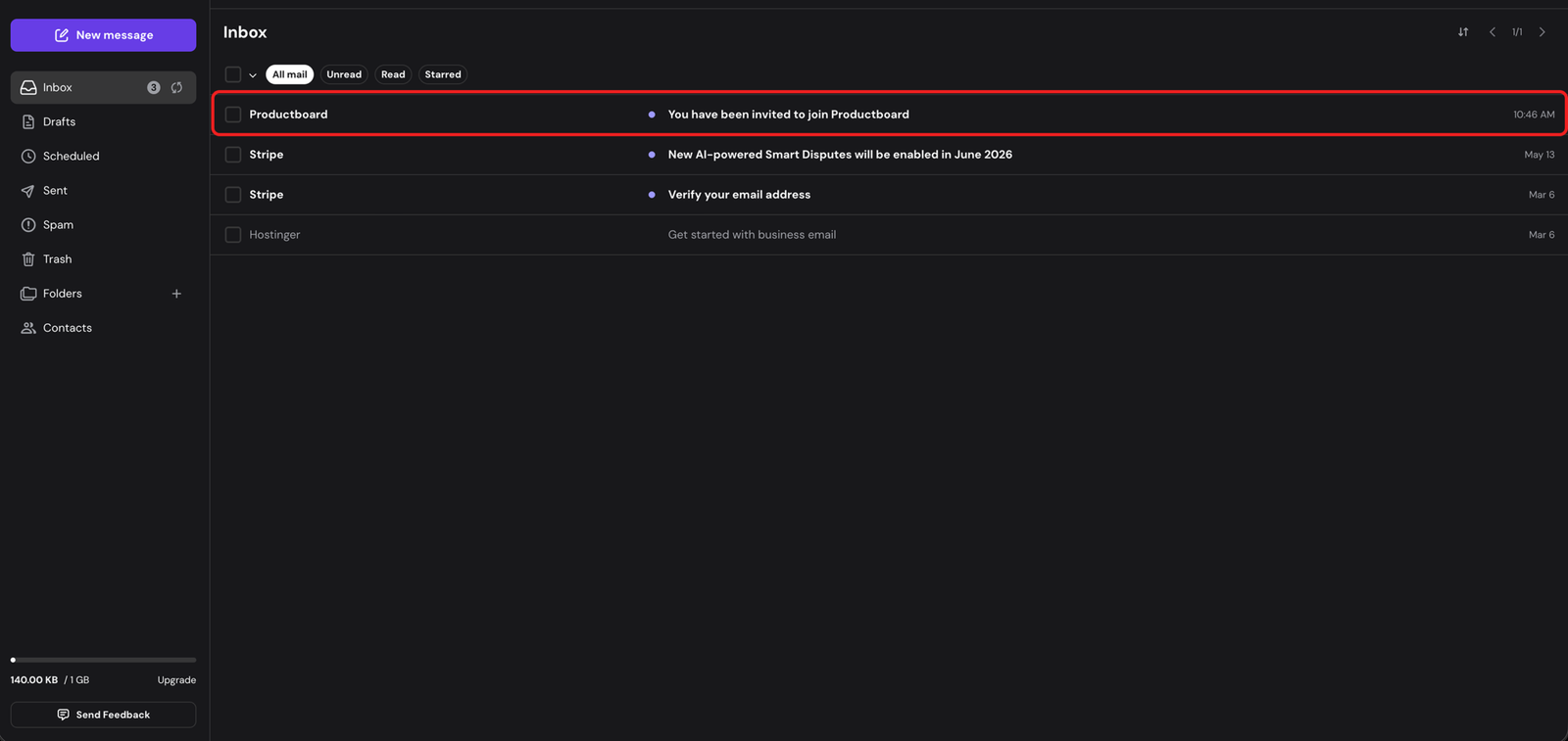
The invite email is recognisable, but does not show which team the person is joining.
The invite reaches the teammate’s inbox with a clear sender, Productboard, and the subject “You have been invited to join Productboard.” They can tell it’s an invitation.
What it doesn’t say is who invited them or which company’s workspace they’re being added to. For someone who wasn’t part of setup, “join Productboard” reads like a product signing them up, not a colleague adding them to the team’s account.
An invite with no name or company behind it is easy to take for marketing and leave unopened. The teammate accepting is what makes the inviter’s collaboration step work, so a generic-looking invite puts that at risk.
Collaboration
Minor problem
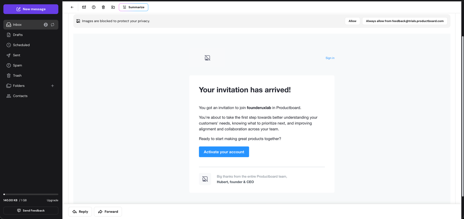
The invite email has a clear CTA, but the supporting copy drifts into broad product messaging
The email clearly says the teammate has been invited to join the founderuxlab workspace and gives them a clear “Accept invitation” button. The weaker part is the supporting copy: it moves from the invite into broad claims about understanding customers, prioritising, and collaboration. For an invite email, the most useful copy is the practical context around joining the workspace, not a general explanation of Productboard’s value.
Collaboration
Minor problem
The signup page doesn't name the workspace the teammate is joining
The page header says “You’ve been invited to Productboard” and prefills their email. What it doesn’t name is the company or workspace they’re joining.
They’re accepting access to an existing workspace, but the page reads like a plain Productboard signup. The email body named the workspace. The signup page drops it again, at the point they create the account.
Collaboration
Major problem
The invite page leads with Google signup, but access is tied to a specific work email
The invite is bound to one work email, and the form prefills it. Above that, the first and most prominent option is “Sign up with Google.”
If the Google account uses a different email, signing up that way can drop the teammate into a new empty account instead of the workspace they were invited to.
Putting Google first, ahead of the email the invite depends on, steers the teammate toward the option most likely to send them to the wrong place.
Collaboration
Minor problem
The learning resources a new joiner needs sit hidden behind the help icon
The invited teammate lands on the Boards page. The workspace is already set up, so they skip the setup checklist, which is right, they didn’t build it.
What they’re dropped into is a set of boards someone else made, with nothing on the page pointing to how to start using them. The help that would do that, the academy and help centre, sits behind the question-mark icon, out of view until they think to open it.
The foundations, as a hypothesis
Every step here was judged against four foundations, pinned down before I looked at a single screen. They’re my best guess, built from public information with no input from Productboard’s team.
On a Sprint, they come from your own research, data, and your team’s knowledge, which is what gives the review its weight.
Who is the user and what's their situation? (User Context)
A Head of Product at a scaling SaaS company, now responsible for a small team of PMs and the roadmap they all work from.
The problem turned urgent when the product feedback outgrew the spreadsheet. It now arrives from too many places at once, and with planning approaching, they cannot point to the evidence behind what is on the roadmap and what is not.
They have tried spreadsheets, docs, a backlog, and slide-deck roadmaps. Each held the information but none connected feedback to what got built.
So they have learned to distrust tools that just store the chaos more tidily.
What outcome does this user want? (Transformation)
The user becomes the person who can open one place and show, for any item on the roadmap, the real customer evidence behind it.
Prioritisation stops being a matter of who argued hardest. The whole team and the stakeholders see the same roadmap and understand why it is ordered the way it is.
What moment earns this user trust? (First Proof)
They see other people from the team opening and using the roadmap they built, and recognise it is becoming the roadmap the team plans and decides from.
What measurable user behaviours show that this user has reached activation? (Proof Action)
A team member other than the builder returns to the roadmap across separate sessions.*
* The exact bar, how many people and how many returns, is what Productboard’s retention data would set, by measuring which trial teams go on to convert.
Deliverables
This is what the Sprint produces
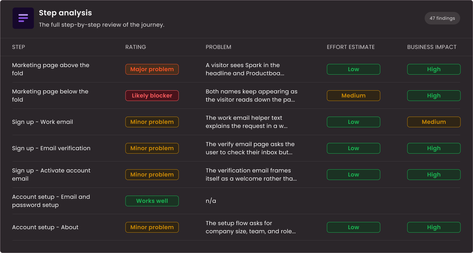
Step analysis
Every step of your onboarding reviewed in a working Notion board. Your team sees what is working, what can be approved, and why.
Prioritised opportunities
Each opportunity scored by impact and effort. Your team knows what to fix first and what can wait.
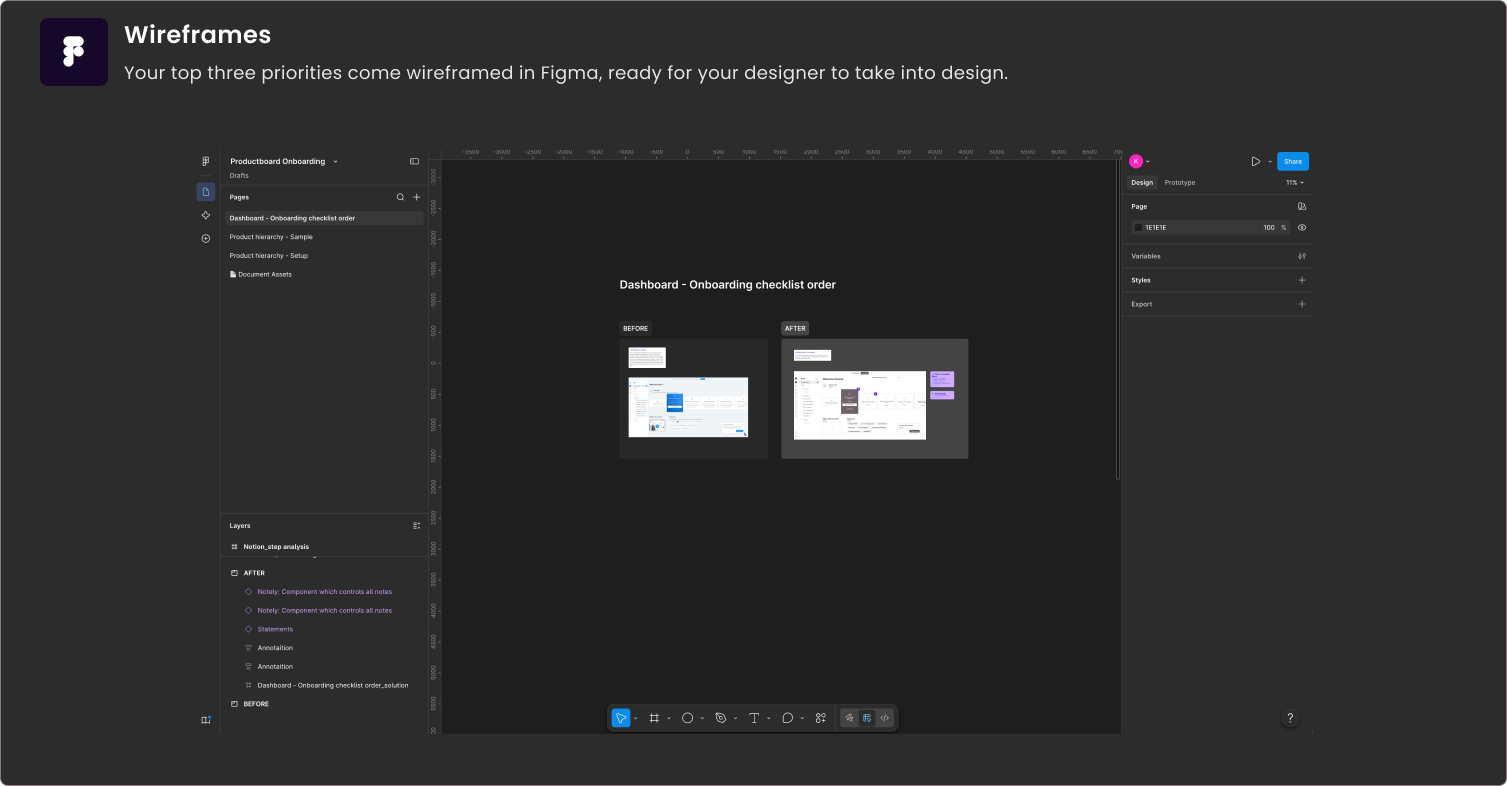
Wireframed solutions
Your three highest-impact priorities wireframed in Figma. Your designer takes them straight into design.
READY TO START?
Get this for your product
Book a free call. You’ll leave with one concrete observation, whether you hire me or not.